CASH HAS NEVER BEEN EASYER
Emerging from the vibrant fifinancial hubs of the USA, Cashley approached Branders with a vision: to refifine andelevate the identity of its cutttting-edge neo-banking platform, celebrated for one-click instant loans.
The initial Cashley brand faced challenges from a dual representation, one focusing on its user-friendly app andthe other on its groundbreaking instant loan feature. Branders' mandate was to create a cohesive identity,resonating with Cashley's diverse clientele from the ambitious entrepreneur to the everyday individual, from thetech-savvy progressive to the traditionalist.
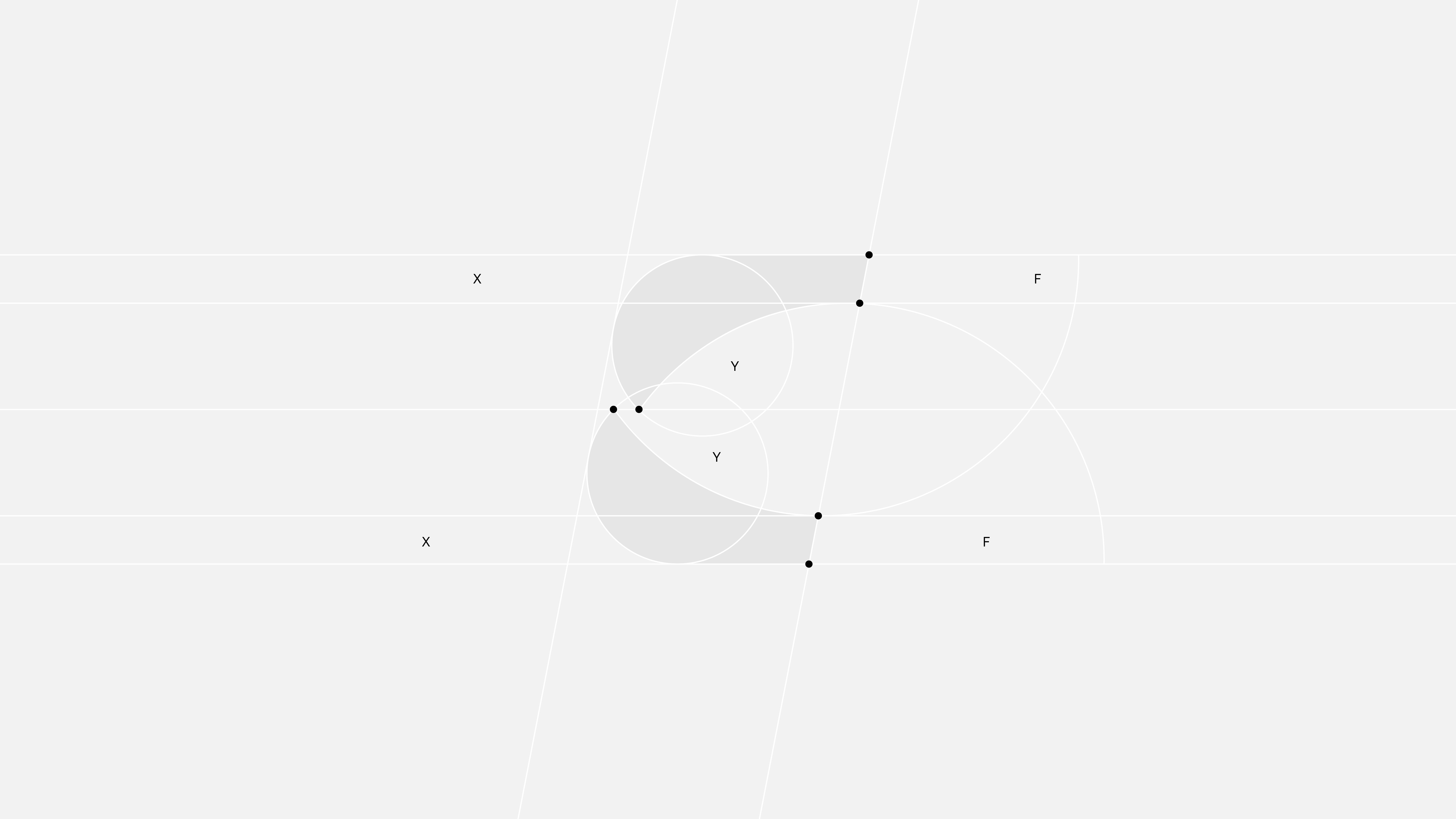
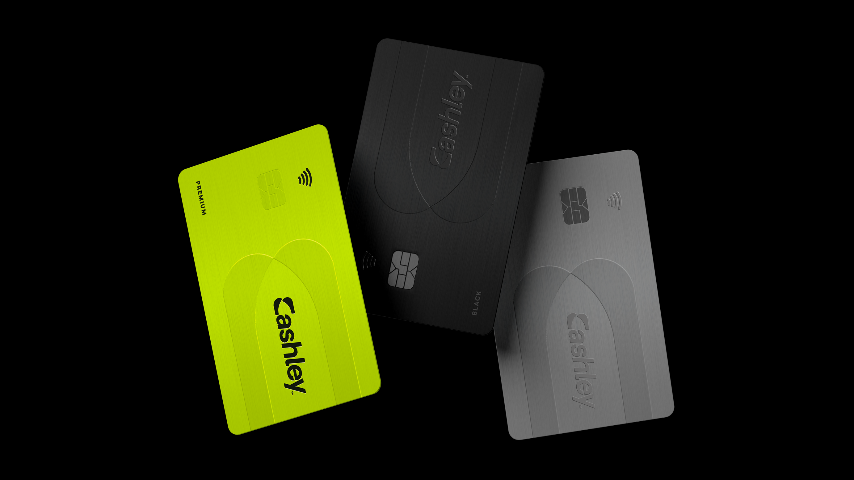
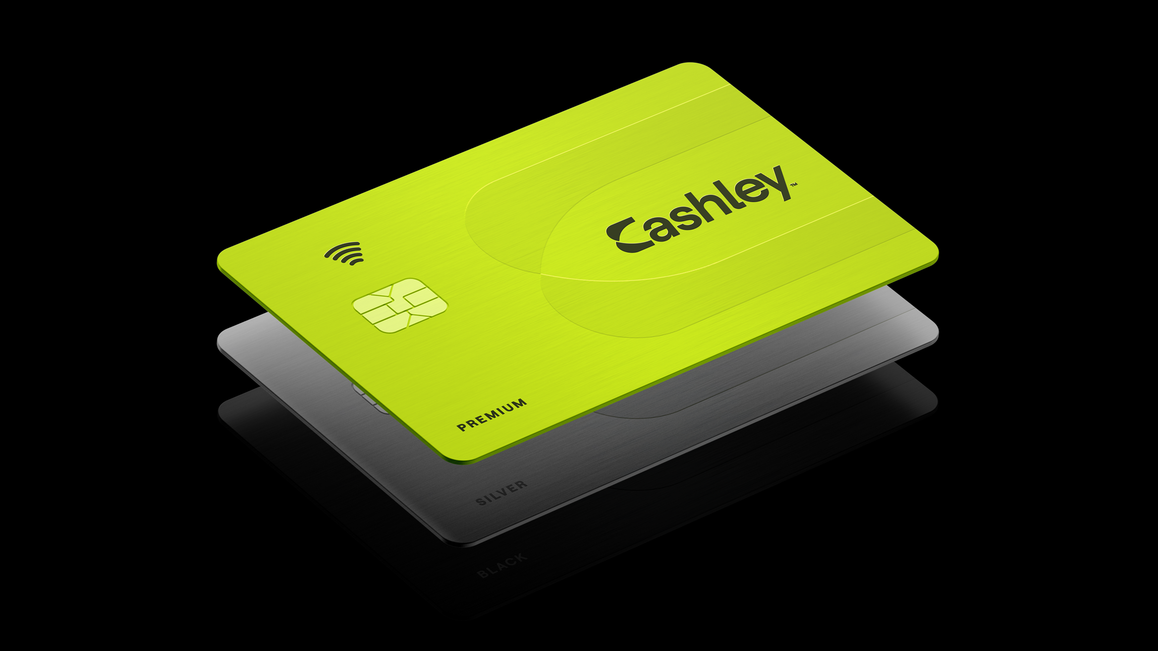
The evolved brand orbits around the Cashley icon. The unmistakable 'C' integrated with a negative space arrow,encapsulates Cashley's essence. Drawing inspiration from its old identity, the arrow symbolizes swift fifinancialmovement and growth, portrtraying Cashley's commitment to forward-thinking solutions.
Brand Identity
Logo Design
Brand Guidelines
Digital Identity
Icon System
Stationery
Brand Personality
Brand Positioning
Verbal Brand
Photography Direction
Scriptwriting
Mobile Application
Landing Page